Stop filtering Rightmove by price alone. Here’s the data that actually tells you what an area is worth.
You open Rightmove. You set your maximum. You hit search. Two hundred results.
They all look the same.
A three-bed semi in one area for £295,000. A three-bed semi somewhere else, same price, similar photos. Both tick the box. But they are not the same. Not even close.
Rightmove shows you what a seller wants. It has no idea what the area is worth to you.
Price is a starting point. Nothing more.
Here’s what a house price tells you: how much demand the seller thinks there is for their property right now. That’s it. It tells you nothing about the crime rate on that street. Nothing about the quality of the nearest primary school. Nothing about whether your broadband will hold up for a morning of video calls. Nothing about whether the area is thriving or quietly struggling.
Two areas can have identical median house prices and completely different everything else. Higher deprivation. More antisocial behaviour. Lower employment. Worse health outcomes. The price tag won’t tell you any of that.
How the KYA Spotlight changes the search
The KYA Spotlight Dashboard lets you layer real data conditions on top of a map and watch the best-matched areas light up in real time. Start with your price range – set a minimum and maximum, just like Rightmove – but that’s only the beginning.
Add a crime percentile. Add a broadband speed threshold. Add a minimum proportion of children in the area. Add an employment level. Add a deprivation score band. The map updates instantly as you adjust each slider. Areas that meet all your conditions glow dark purple. Those that miss on one or two show in blue or green. Areas with no matching conditions show no colour on the map.
Instead of 200 identical results, you see a handful of genuinely well-matched areas – colour-coded by how closely they fit your life, not just your budget.
A real example
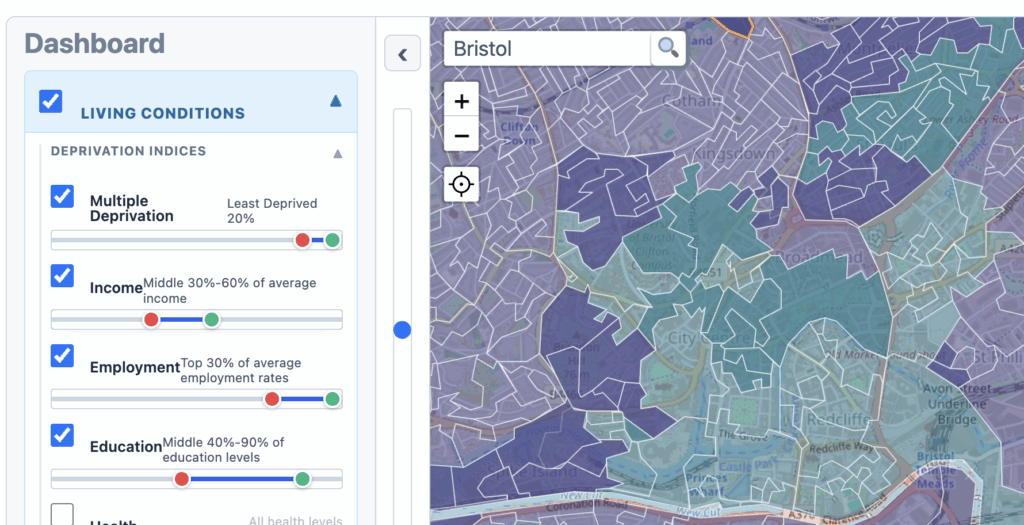
Two areas, same £280,000 median price – one an outer suburb of a northern city, one a commuter town 30 miles from London.
The northern suburb: low crime percentile (top 15% safest in England), high broadband coverage, high child proportion, low deprivation. Dark purple on the Spotlight.
The commuter town: moderate crime, variable broadband, low child proportion, higher deprivation pockets. Green on the Spotlight – fine, but clearly not the same match.
Same price. Different area. The Spotlight shows the difference before you ever visit.
Start with price. Don’t stop there.
The data exists. The Spotlight makes it searchable. The questions are worth asking before you fall in love with a house and make an offer based on a price and a set of photographs.
Your next move is worth doing properly. Unlock the full KYA Spotlight Dashboard – all data layers, all of England – for £49.99 a year. Or start with Lite at £4.99/month. knowyourarea.co.uk