See for yourself: Test our live maps
We know that “seeing is believing.” Before you start your subscription, we want you to experience the power of Know Your Area firsthand.
Below, you will find four interactive sample maps. Feel free to zoom in, click around, and explore the data.
Please Note: In samples 1 and 2, we have kept the top-level data visible but greyed out the deep-dive filters (such as health, housing quality, population density, age demographics, and others).
To unlock every filter for every postcode in England, simply Join our Monthly or Annual Plan.
Sample 1: House Price Heatmap
See the market value at a glance.
This map demonstrates our Property Price Layer. It allows you to instantly visualise the average property values in a specific area, helping you spot bargains or identify premium streets.
-
What you can see: The “Overall Price” overlay, showing you general value trends in the area.
-
What is unlocked with a subscription: In the full version, the greyed-out options (all property types, affordability, property gains over 1, 2, 3, 5 and 10 years) become fully active for the whole country.
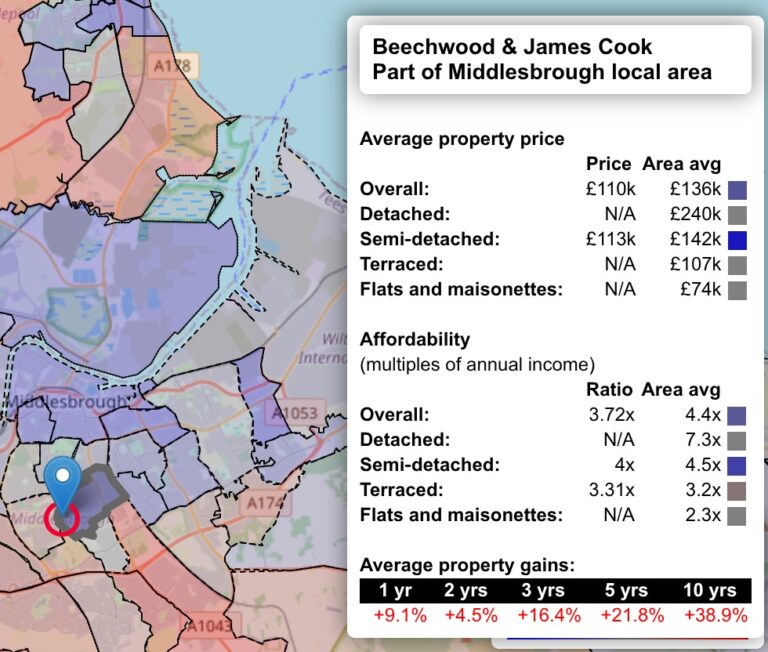
Property price sample
Click to try it out. Once inside the map, click on the magnifying glass and type in a postcode, town or village.
Property map
-
Sample 2: Community Deprivation Data (‘Living Conditions’)
Understand the heartbeat of the neighbourhood.
Using official government data on “Index of Multiple Deprivation”, this map gives you an immediate sense of an area’s prosperity and infrastructure.
-
What you can see: The “Overall Deprivation” score.
-
What is unlocked with a subscription: A full membership unlocks the greyed-out specific categories, allowing you to drill down into:
Income, Employment, Education, Health, Crime, Housing, Population density, Age demographics.
-
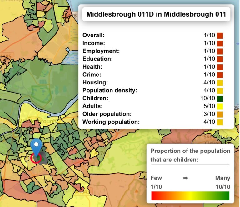
Living conditions sample
Click to try it out. Again, use the magnifying glass and type in a postcode, town or village to search.
Living conditions overlay
Sample 3: The Political Landscape
Know who represents you.
A simple, clear visualisation of the latest General Election results.
-
What you can see: A full breakdown of the constituency, showing the elected MP, party majorities, and voting boundaries. This data is fully accessible in this sample to help you understand the political profile of the area.
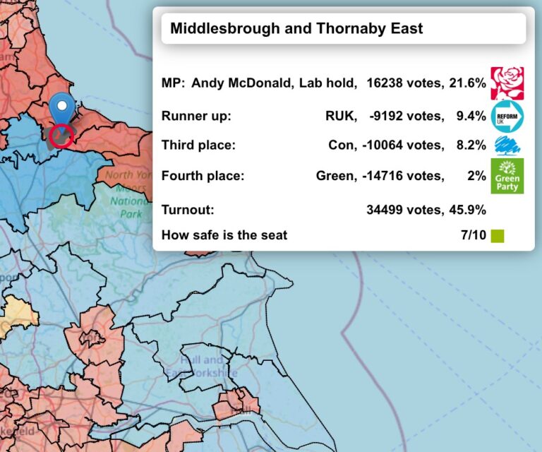
Constituency map
Your chance to see the political breakdown of the UK, from the latest election results.
Constituency breakdown
Sample 4: The Full Experience (Cornwall Demo)
Try the tool with zero restrictions.
Want to see exactly what a subscriber sees? We have unlocked every single feature for the county of Cornwall.
Go ahead—treat this map as your playground. Toggle the switches on the menu to overlay different datasets simultaneously and see how powerful the tool really is.
Everything is active:
-
✅ Check property prices, affordability and price rises across all property types
-
✅ Check deprivation data (Income, Employment, Education, Health, Crime, Housing, Population density, Age demographic)
- ✅ Check flood risk information, and increased insurance premiums from the flood risk
- ✅ Check radon gas exposure
- ✅ Check broadband coverage
- ✅ View School Ofsted Ratings
- ✅ Check health institutions (doctors, dentists, hospitals, care homes, nursing homes) with all CQC inspection results
-
✅ Locate damaging power infrastructure, Landfill sites and Prisons.
- ✅ Highlight best and worst areas in Cornwall, and learn why.
- ✅ Generate a detailed report for all of Cornwall
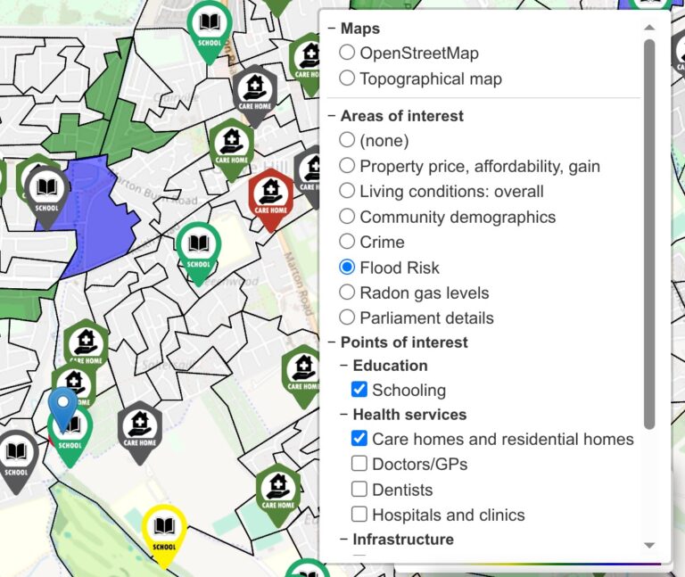
All of Cornwall
Roam around freely. Enable and disable all the layers (selected from the top right selection ‘toggle’.
Cornwall at a glance
Ready to see this data for your street?
You have seen how it works in Cornwall. Now uncover the truth about the area you want to call home.
Unlock the full map today for just £4.99/month.